Case study
Azul Consulting Africa
An enterprise IT consultancy needed a site that matched how the business actually presents itself to the people it sells to.
- Client
- Azul Consulting Africa
- Industry
- Enterprise IT consulting
- What we did
- Website design, Development, Content restructure, Launch and hosting
- Year
- 2026
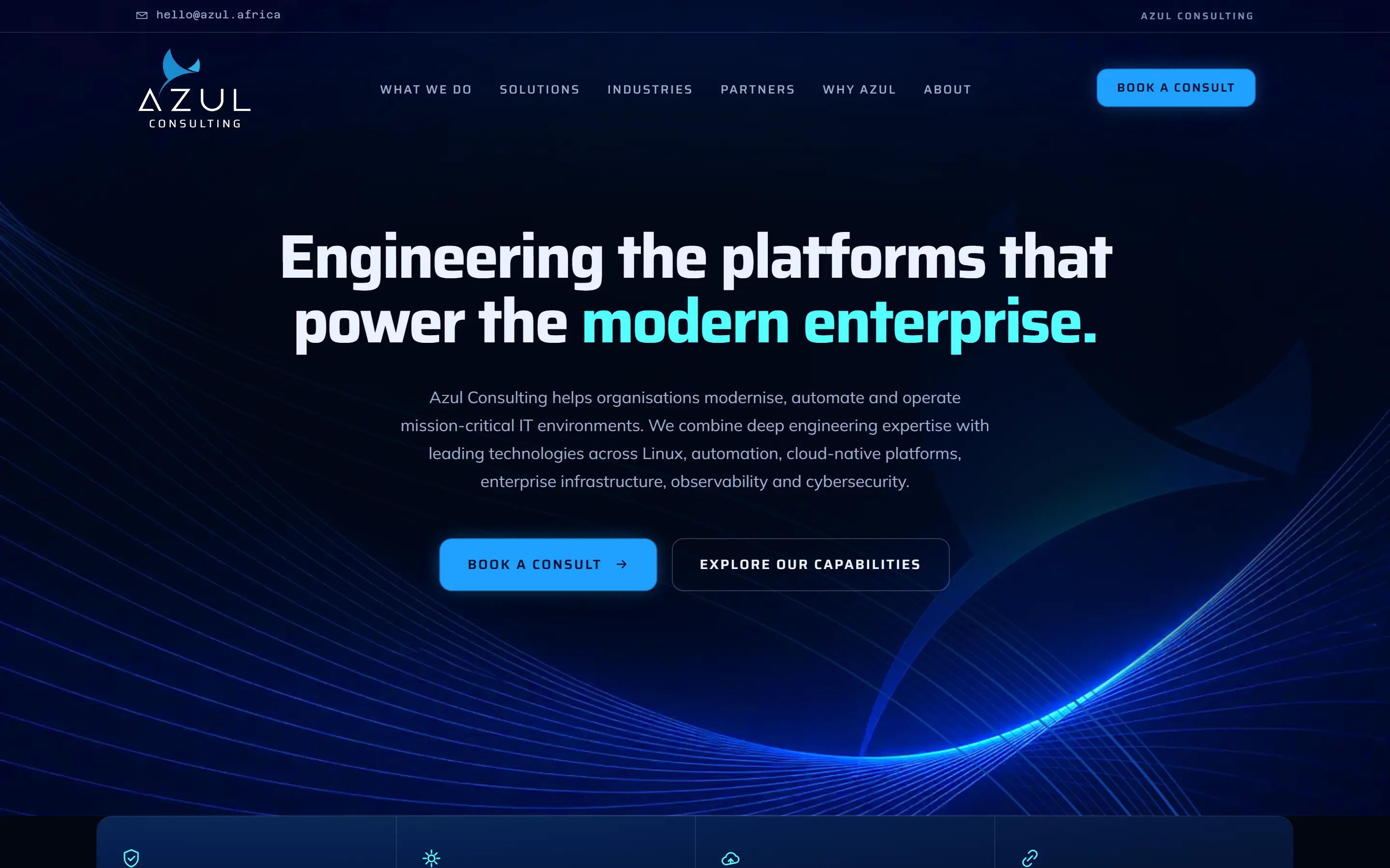
Azul Consulting Africa, as it is now
The challenge
What was not working.
Azul was running an older WordPress site that no longer reflected how the business presents itself to enterprise buyers. Its content had fallen behind the current company overview, so the site was describing a version of the company that had moved on.
That is a harder problem for a consultancy than for most businesses. The people Azul sells to are technical, they arrive already comparing suppliers, and the site is the first thing they judge the engineering on.
What it needed was a fast, credible site that clearly explains what Azul does, who it serves and who it partners with — in the order a buyer actually asks those questions.
Our approach
What we decided to do.
We rebuilt it from scratch rather than patching the WordPress site. Patching would have carried the old structure forward, and the structure was most of the problem: the content had to be reorganised, not re-skinned.
The content was restructured around Azul's current company overview — what they do, the capabilities underneath it, the industries they serve, who they work with, and why a buyer should choose them. Each capability got a page of its own, so a specific question has a specific URL to land on.
The design was built around Azul's existing brand and logo without altering either. And it was built for speed and for easy upkeep, because a site nobody can update is a site that goes stale again within a year.
What we built
Every piece, and why it is there.
- Nine primary pages, restructured around the company overview
- An enterprise buyer needs to place a supplier before they will contact one. The order of the pages is the order they ask.
- Seven solution pages, one per capability
- A specific question deserves a specific URL — one a salesperson can send, and one a search engine can rank on its own terms.
- A contact form that validates on the server
- It posts to an API route that rejects an incomplete submission, so an enquiry either arrives complete or the sender is told why not.
- A hidden honeypot field on the form
- It catches automated submissions without making a real person solve a puzzle to get in touch.
- Per-page titles, descriptions, canonicals and share cards
- Every page has to explain itself when it is the first one somebody lands on, or the first one somebody pastes into a chat.
- A sitemap, a robots file and Organization structured data
- Search engines and AI assistants find every page without guessing, and can read who the business is rather than infer it.
- A privacy policy, and a form that says where your details go
- The form collects personal information, so POPIA applies. Saying so beside the form is cheaper than being asked.
- Security headers set at the edge
- Content Security Policy, HSTS, frame and referrer policy. Enterprise procurement checks these, and passing is easier than explaining.
Pages
- Home
- What We Do
- Solutions
- Industries
- Partners
- Why Azul
- About
- Contact
- Privacy Policy
- Solutions — Platform modernisation
- Solutions — Automation
- Solutions — Cloud native
- Solutions — Enterprise Linux
- Solutions — Observability
- Solutions — Managed services
- Solutions — Cybersecurity
Built with
- Next.js
- Tailwind CSS
- Vercel
Screens
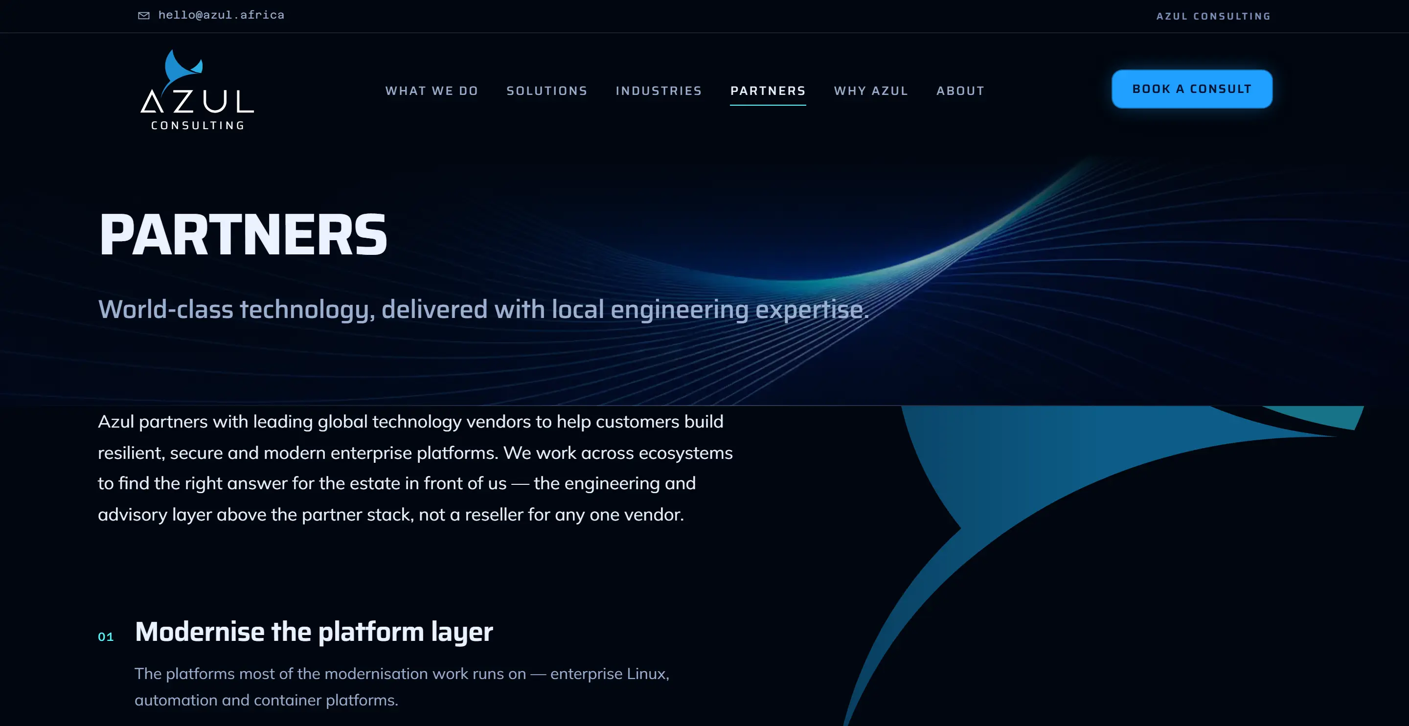
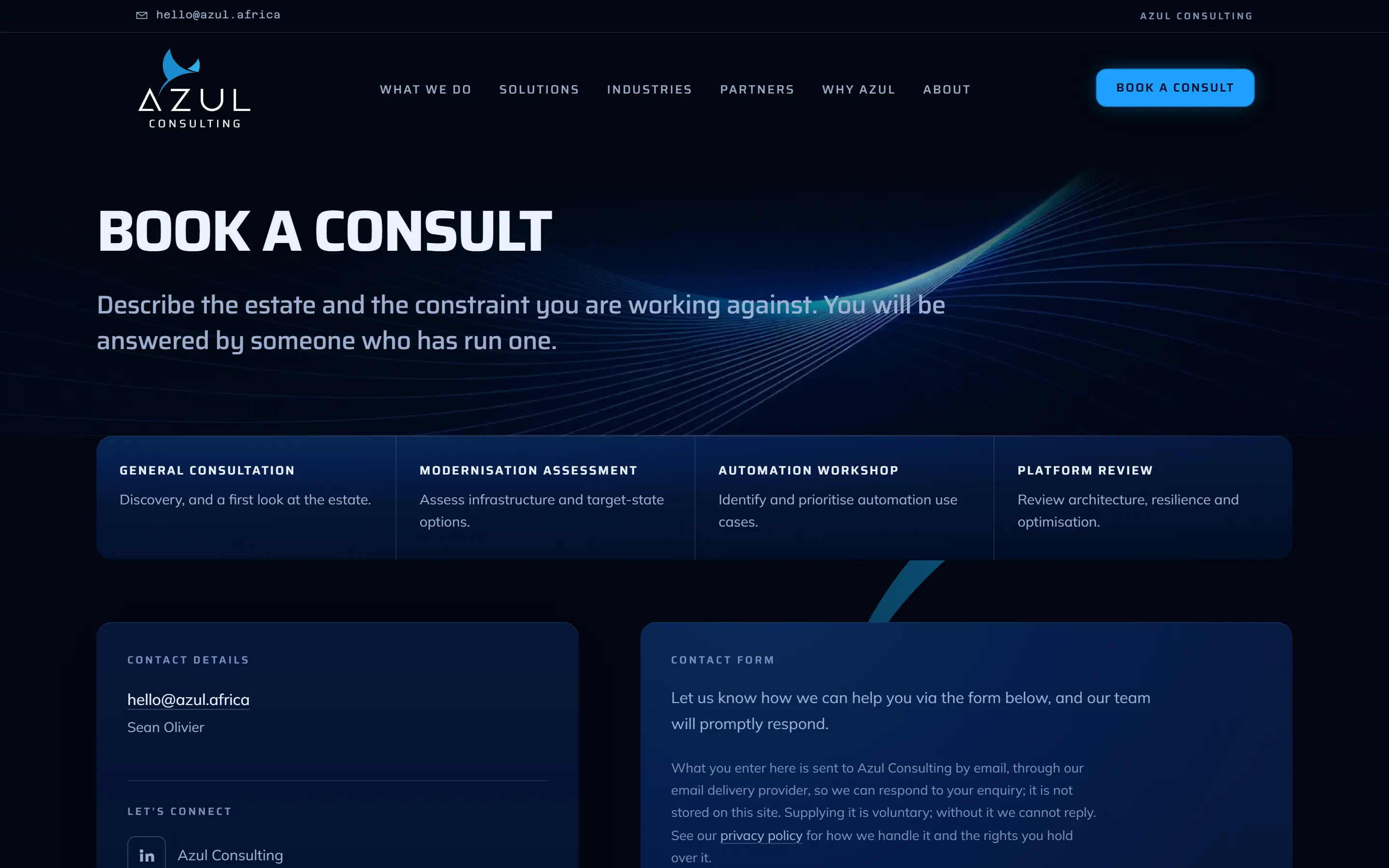
What it looks like on a laptop and a phone.
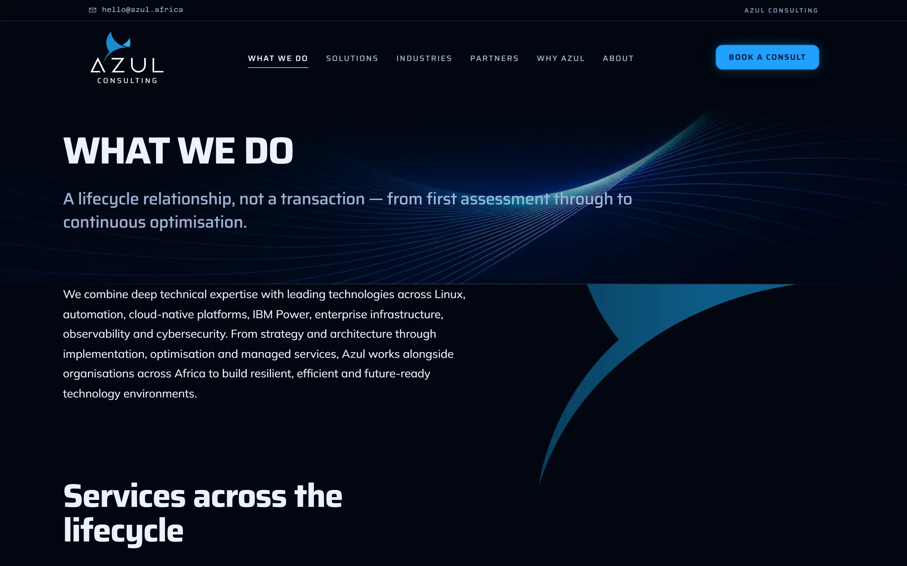

The home page on a phone, which is where a lot of first looks happen. 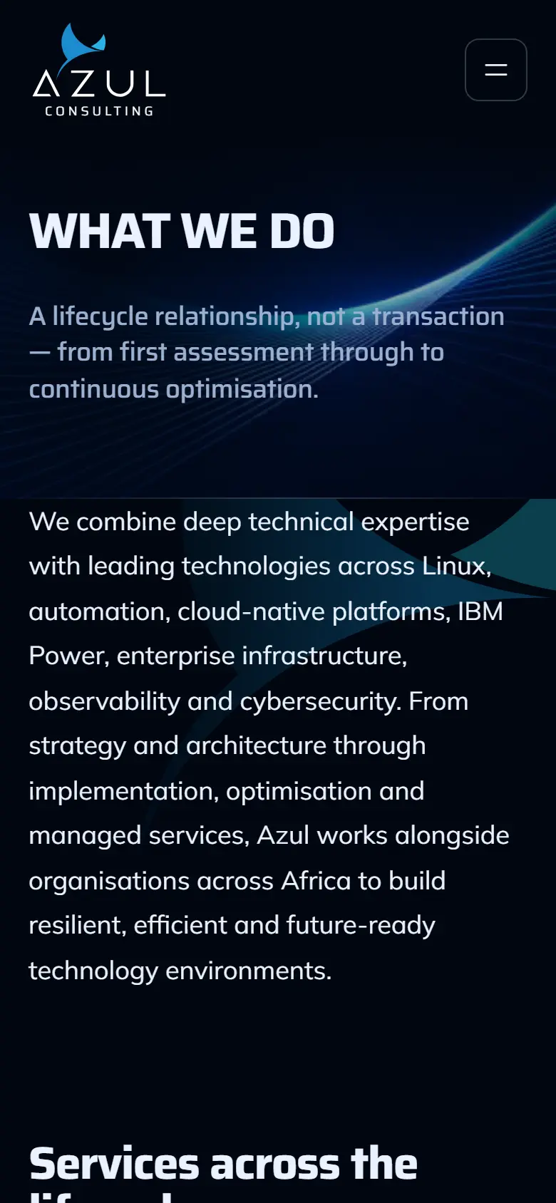
What We Do on a phone. Same content, one column, nothing dropped.
Results
What changed, and where the number came from.
Every figure names its source. A number without one is not a result, it is a claim.
- Live since
- September 2026Source: www.azul.africa, checked 16 September 2026
- PageSpeed performance, mobile
- 98Source: PageSpeed Insights, home page, tested 16 September 2026
- PageSpeed performance, desktop
- 100Source: PageSpeed Insights, home page, tested 16 September 2026
- Lighthouse performance, every route
- 92–96Source: Lighthouse across every route, 16 September 2026. 94.2 average.
- Accessibility, best practices and SEO
- 100Source: Lighthouse across every route, 16 September 2026. The privacy policy page scores 69 on SEO because it is deliberately not indexed.
- Built on
- Next.jsSource: Response headers on the live site name Next.js on Vercel, 16 September 2026
Ready when you are
Want one of these for your own business?
We build a working version of your site first, from a ten-minute brief. You open it on a link, you pay nothing to look at it, and you decide from there.