Case study
Living Giving
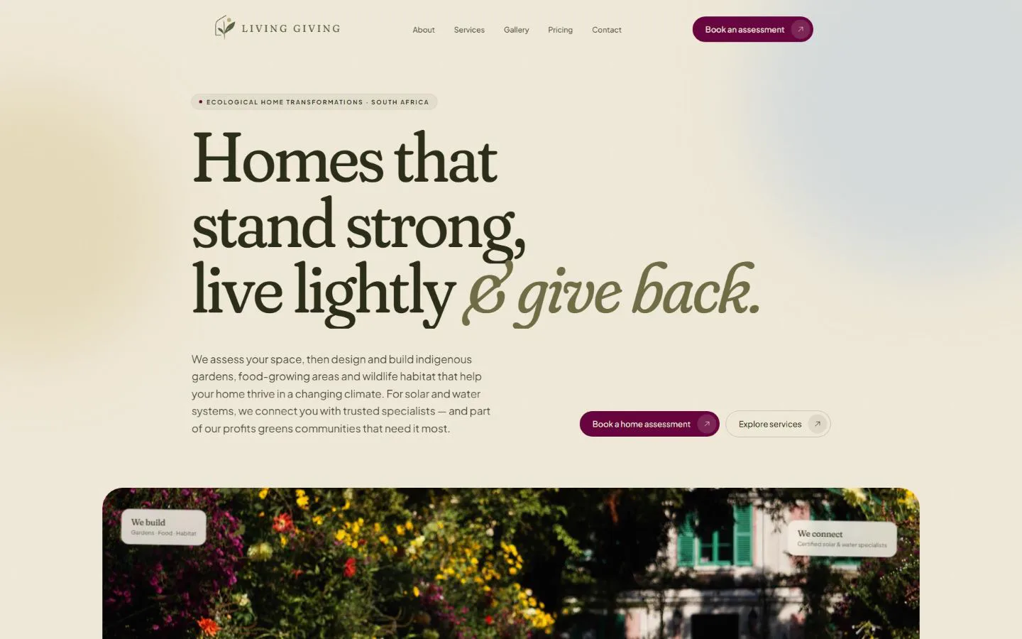
A new South African business needed a website that made an unfamiliar service feel clear, credible and worth booking.
- Client
- Living Giving
- Industry
- Ecological home transformations
- What we did
- Website design, Development, Content structure, Enquiry handling
- Year
- 2026
The challenge
What was not working.
Living Giving turns gardens and outdoor spaces into indigenous, food-growing, water-wise ecosystems, brings in trusted specialists for solar and water, and puts part of every project back into community gardens. That is several ideas at once.
A new business does not get long to explain itself. A visitor who cannot tell within a few seconds whether this is a landscaper, a solar installer or a charity leaves without asking.
And it was launching without a track record to point to: no finished projects of its own to photograph yet. The site had to earn a first enquiry on clarity alone.
Our approach
What we decided to do.
We built the story in the order a homeowner asks it: what you do, what it changes, how it works, what it costs, how to start. Each of the six services got its own section, so nobody has to decode a single all-in-one pitch.
The design is calm and botanical — a serif headline face on a warm cream ground — because the service is about patience and living things. Motion is spent only where it carries meaning: the manifesto fills in as you read it, the services travel past on one pinned track, and the logo draws itself.
Honesty is built in rather than added. Where photographs are illustrative the gallery says so on the page, and the contact form tells a visitor exactly which field to fix instead of failing silently.
What we built
Every piece, and why it is there.
- Six pages, in the order a homeowner decides
- Home, About, Services, Gallery, Pricing, Contact. Each page answers the question the one before it raises.
- One section per service, with a sticky index
- Someone who arrived for food gardens should land on food gardens, not scroll past five other offers to find it.
- A before-and-after card and a five-step process
- Assess, design, build, connect, check. An unfamiliar service gets a lot less risky once you can see what happens next.
- A gallery filtered by theme, and labelled honestly
- It shows what is possible while saying, on the page, that the images are illustrative until the first projects are photographed.
- An enquiry form that validates on the server
- Province, enquiry type and a South African phone format are checked before anything is sent, and errors are named field by field.
- A fallback when email delivery fails
- If the message cannot be sent, the visitor is given the phone number and email address instead of a dead end.
- A hidden honeypot field
- Automated submissions are dropped quietly, without asking a real person to solve a puzzle.
- Structured data, a sitemap and a robots file
- Search engines can read the business as a home-and-construction service, and the pricing questions as an FAQ.
Pages
- Home
- About
- Services
- Gallery
- Pricing
- Contact
Built with
- Next.js
- Tailwind CSS
- Motion
- Resend
- Vercel
Screens
What it looks like on a laptop and a phone.
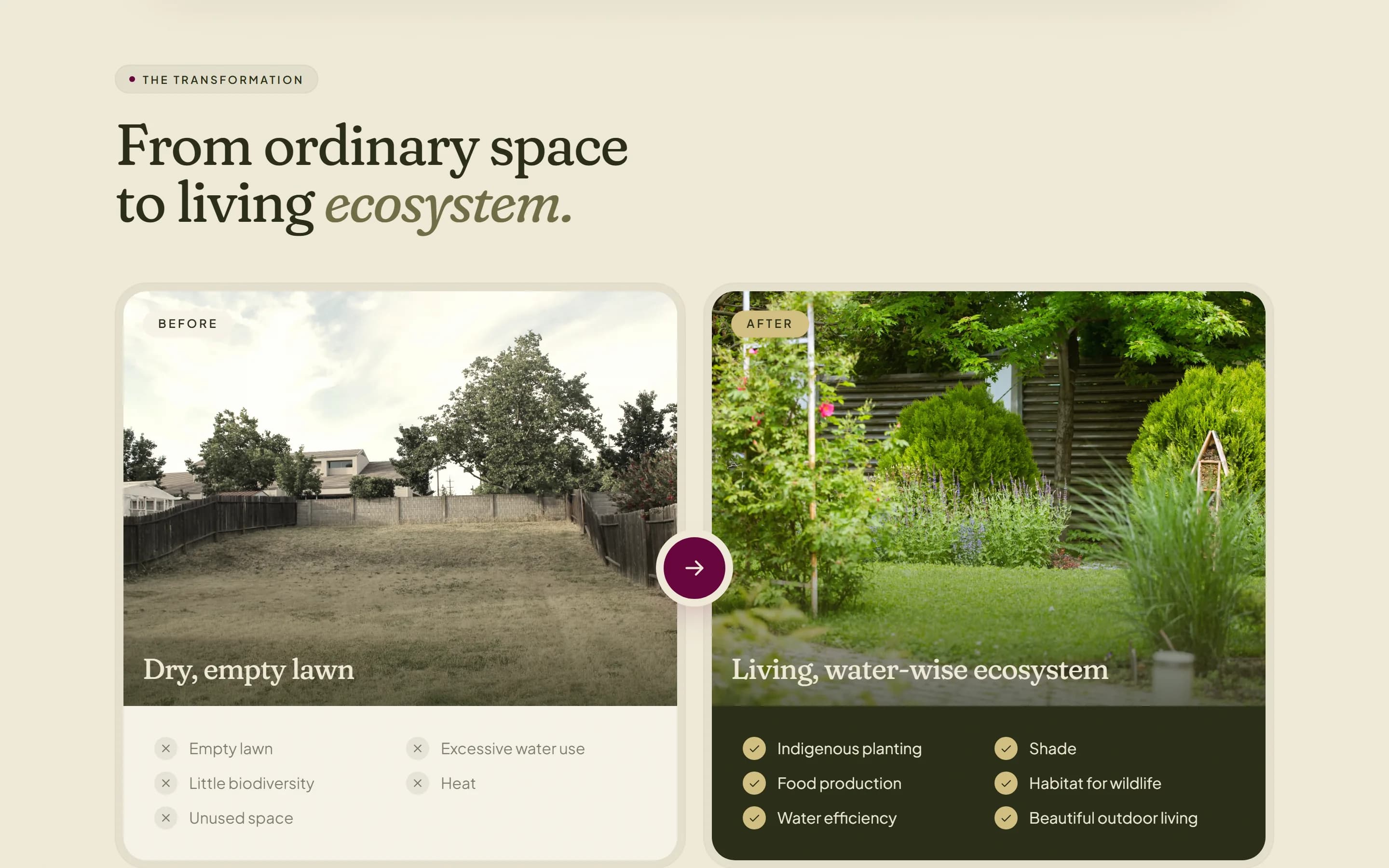
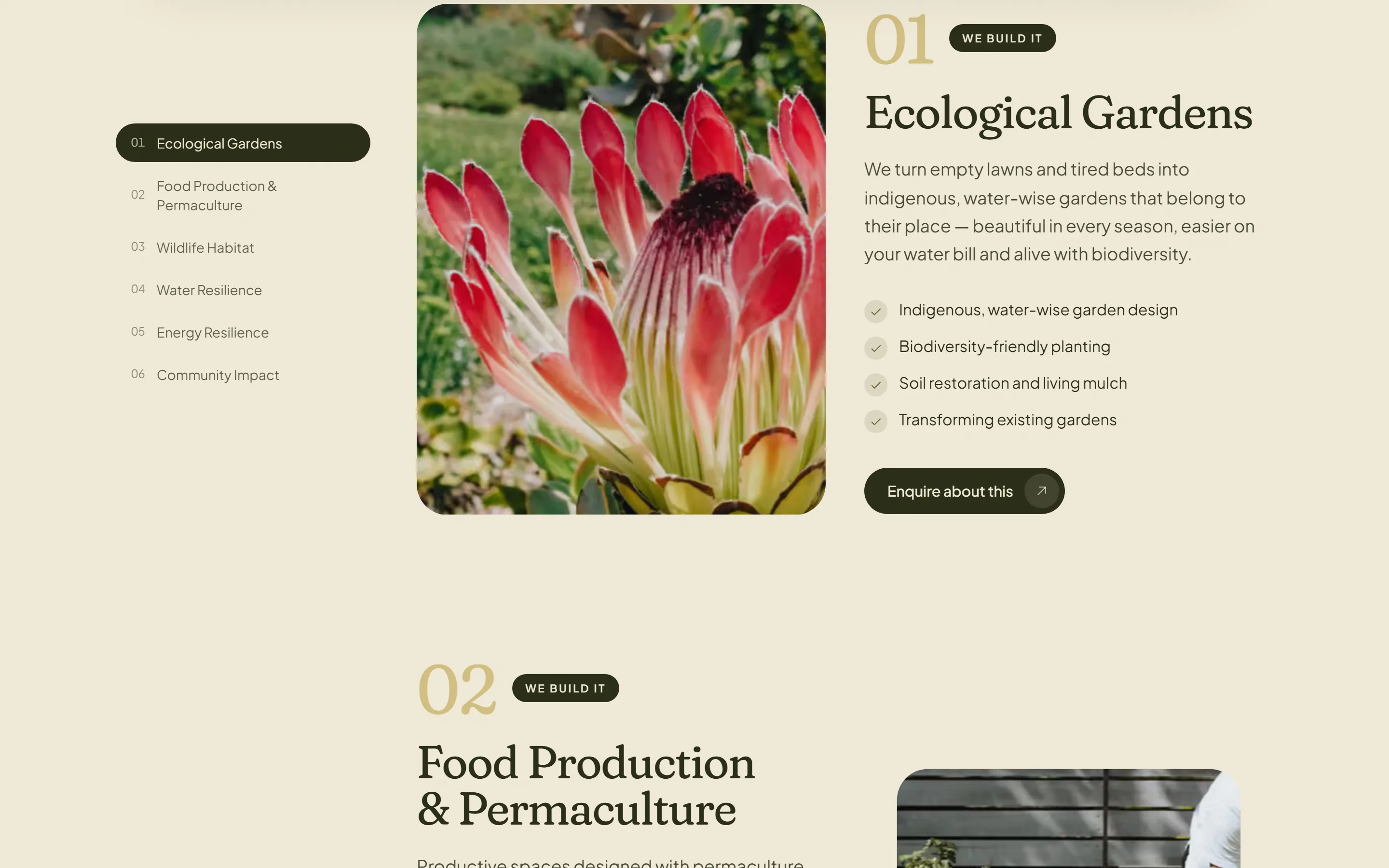
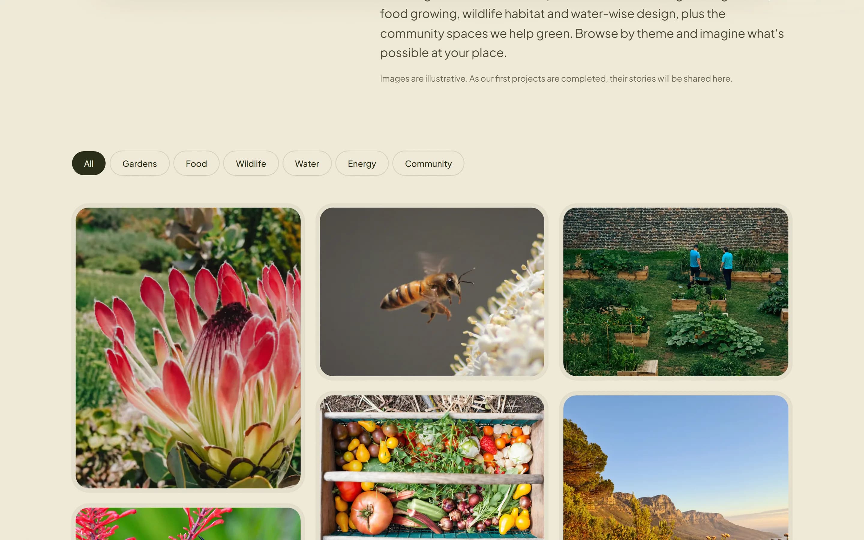
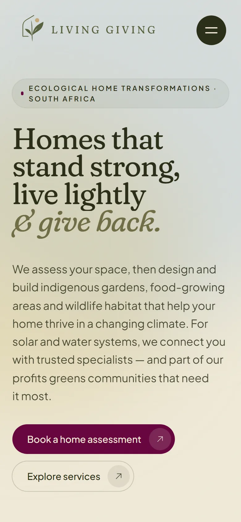
The home page on a phone, where most first looks happen. 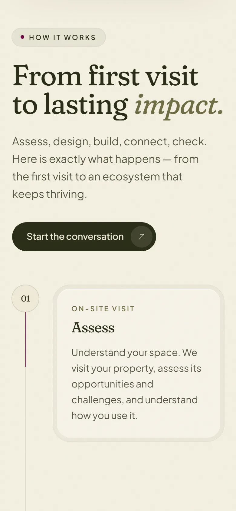
The five-step process on a phone, one step at a time.
Results
What changed, and where the number came from.
Every figure names its source. A number without one is not a result, it is a claim.
- Lighthouse performance, desktop
- 99Source: Lighthouse 12.8.2, home page, desktop preset, 14 October 2026
- Best practices and SEO
- 100Source: Lighthouse 12.8.2, home page, mobile and desktop, 14 October 2026
- Built on
- Next.jsSource: Response headers on the live site name Next.js on Vercel, 14 October 2026
Next project
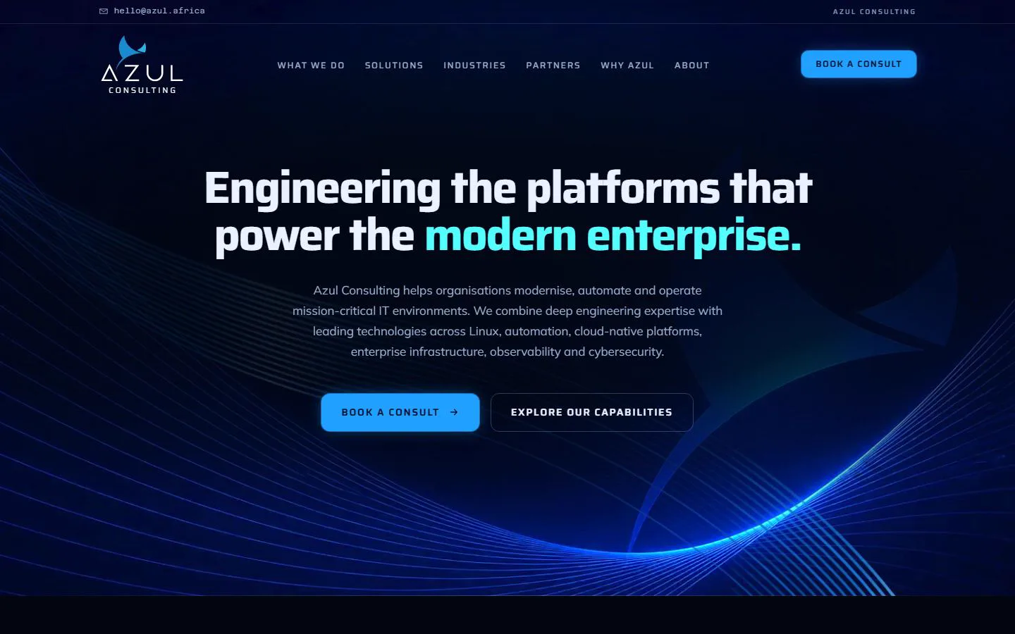
Azul Consulting Africa
Enterprise IT consulting
An ageing WordPress site replaced with a fast, current build that explains what Azul does, who it serves and who it works with.
Ready when you are
Want one of these for your own business?
We build a working version of your site first, from a ten-minute brief. You open it on a link, you pay nothing to look at it, and you decide from there.